Pablo Rodriguez
←
Back
👁️
Works
✋🏼
About
💬
Contact
Led the end-to-end design of a B2B analytics dashboard that transformed how real estate developers track property interest, optimize sales strategies, and make data-driven decisions—reducing reporting time by 85% and increasing lead conversion by 40%.

Real estate developers using Eyefly were flying blind:
Developers were paying for a premium platform but couldn't measure its impact on sales. Several enterprise clients threatened to churn without analytics capabilities.

I designed a comprehensive analytics dashboard that transforms raw data into strategic insights:
The dashboard became a competitive differentiator, helping Eyefly retain enterprise clients and win new business.
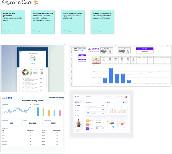
I led a comprehensive 3-week discovery phase to understand user needs, data availability, and business objectives.
User research revealed critical needs that shaped the product direction:
"I need to know which units to push before my Monday sales meeting"
Sales Directors needed weekly insights delivered by Sunday night to prepare team priorities.
"Favorites are more valuable than views—those are serious buyers"
Users who favorited units had 8x higher conversion rate than casual browsers.
"I manage 5 towers—I can't look at everything at once"
Large developments needed filtering by building/tower to focus attention.
"Time on page tells me if someone is serious or just browsing"
Engagement duration was a key indicator of purchase intent.
I defined two primary personas based on research findings:
Sales Director, Luxury Developer
Goals: Prioritize hot leads, prepare weekly reports, optimize sales team allocation
Pain Points: Spends 6+ hours weekly on manual reporting, can't identify serious buyers
Quote: "I need insights, not just data. Tell me what to do with this information."
Success Metric: Time to generate weekly report
Marketing Manager, Mid-Market Developer
Goals: Understand which floor plans to promote, measure campaign effectiveness
Pain Points: No visibility into what content resonates, can't prove marketing ROI
Quote: "I'm spending money on ads but have no idea if they're driving the right traffic."
Success Metric: Lead quality improvement
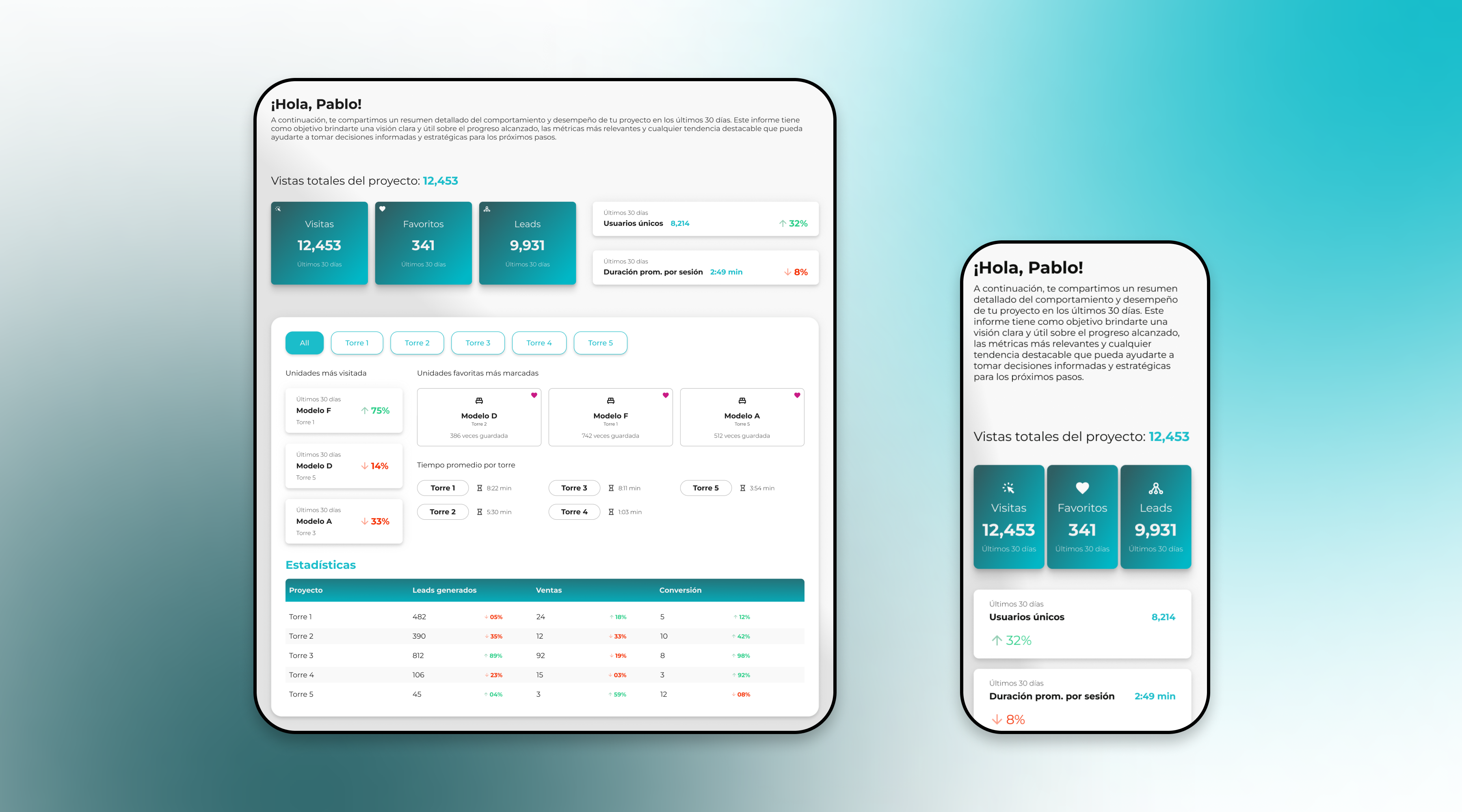
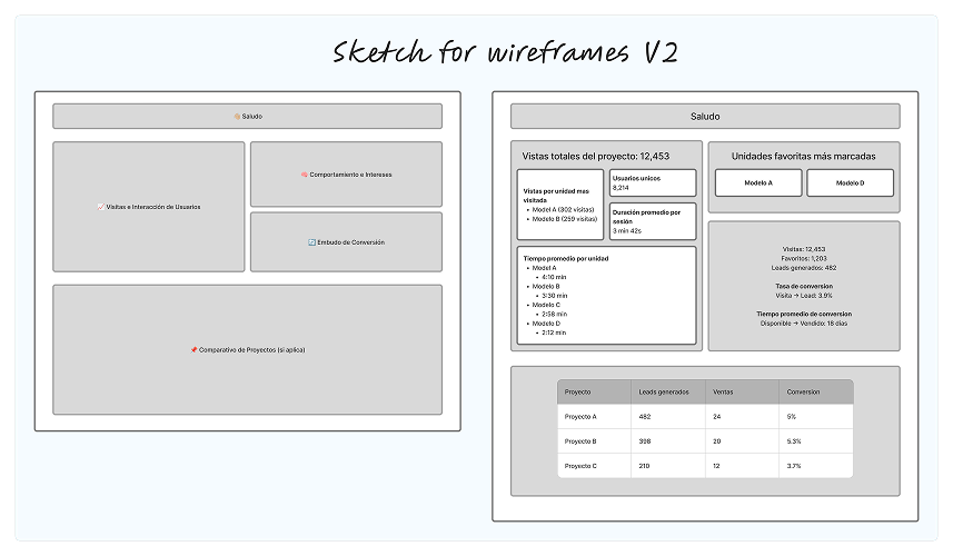
I organized the dashboard into a clear hierarchy based on user priorities:
Several critical decisions shaped the final product:
Challenge: How to display multiple metrics without overwhelming users?
Solution: Color-coded cards with clear hierarchy—primary metrics in teal, secondary in white. Each card shows the metric, value, time period, and trend indicator.
Result: Users could identify key metrics in under 5 seconds during testing.
Challenge: Large developments have 5+ buildings with hundreds of units.
Solution: Pill-based filter navigation allowing users to view "All" or focus on individual towers. Selection persists across all dashboard sections.
Result: Reduced cognitive load and allowed focused analysis by building.
Challenge: Users needed to see unit availability at a glance across floors.
Solution: Grid-based floor plan with visual encoding—bold text for available, light text for sold/reserved. Organized by floor (rows) and unit number (columns).
Result: Sales teams could identify available inventory instantly without scrolling through lists.
Challenge: Raw numbers lack context—is 12,453 visits good or bad?
Solution: Added percentage change indicators (↑32%, ↓8%) comparing to previous period, color-coded green for positive and red for negative trends.
Result: Users could immediately understand performance trajectory without historical comparison.
The dashboard provides a comprehensive view of property performance at multiple levels of detail.
The dashboard launched to all enterprise clients and exceeded expectations within the first 60 days:

Led the design of a dedicated payment platform that increased conversions by 35% and reduced bounce rate by 52%.